For my day job, I am a Ph.D. candidate in meteorology at the University of Oklahoma where I work as a graduate research assistant. Needless to say, I am a weather junkie. As spring blooms in the central plains, an important part of staying on top of severe weather is convenient, mobile access to radar data. My go-to app for some time has been Storm Spotter. It is developed by Ross Kimes - a senior meteorology major at the University of Oklahoma.
Having first used Storm Spotter in its early days, I have witnessed the continual dedication of Ross to improve his users’ experience. The result has been an increasingly polished mobile radar app, exemplified in the newly released major update. I have had the pleasure of beta-testing Storm Spotter 3.0 for several weeks. This past weekend offered a great opportunity to stress the app, with more than 140 tornado reports across Iowa, Nebraska, Kansas, and Oklahoma. Now that it is officially available in the App Store, I wanted to share the new features and offer my impressions of Storm Spotter 3.0.
###Visual Changes###

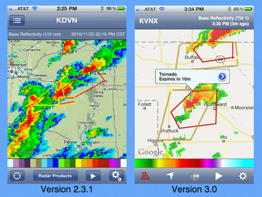
The new update features a simplified user interface, with all buttons now collected on the bottom of the screen. The immediate result is a more intuitive layout with an added emphasis on the map itself. This is extremely important on the iPhone, where screen real estate is limited.
The data button now turns red to indicate active warnings. The warnings list is no longer only sorted by state. Instead, users can view warnings by time, distance from radar, or distance from user. I am glad this was changed because when I am tracking live storms - such as this past weekend - I want to see the latest warnings and those closest to my radar of interest. Selecting a warning will zoom to the nearest radar.
Warning polygons are now more visually prominent and stable. In previous versions, the polygons would disappear when panning and zooming the map. Now they remain persistent on any view of the radar. One of my favorite new features is the custom annotation that pops up on warning polygons (as seen in the image above). Selecting the annotation button will display the accompanying warning text directly on the map. This makes the entire process more efficient than in past releases where text was in a separate list.
In Storm Spotter 2.3.1, the radar data selection was chosen via a long, clunky list. Choosing between reflectivity and velocity could be rather cumbersome. Now in version 3.0, the radar list is presented in a friendly grid. This makes jumping between products much faster, often requiring only two simple taps. To make things even simpler, the app settings were pared down to remove many unused options.
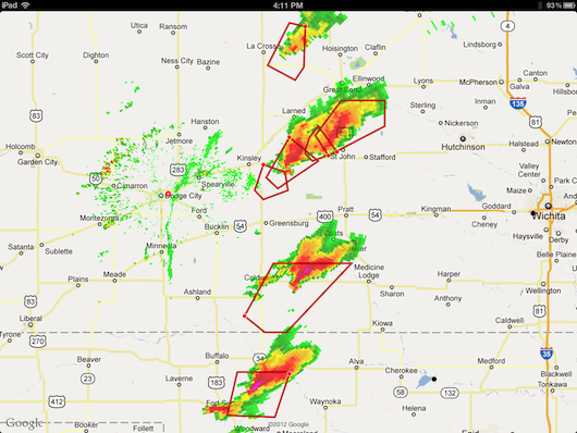
My favorite way to view radar in Storm Spotter 3.0 is in full-screen mode. To enter this mode, the user simply taps on the screen for a quick second. In order to exit full screen, repeat the same procedure. I love this mode because the chrome and fluff goes away so that users can focus on what matter most - the gorgeous radar display. Below is an example of full-screen reflectivity on the iPad.

###Under-The-Hood Changes###
The first thing users will notice in Storm Spotter 3.0 is how much faster data loads. Previous versions would often load radar images slowly or stop updating in certain circumstances. Those bugs are gone in my testing, resulting in a more fluid experience when switching between radars.
The improved load speed is due in part to the incorporation of higher resolution Level 3 data in Storm Spotter 3.0. The app now contains 256 levels of data instead of the previous 21. In fact, it is the only app to combine Level 3 data with Google Maps.
Also of note is that Storm Spotter 3.0 now provides reflectivity and velocity data on four tilts instead of just the lowest tilt used in previous versions. The app now uses servers from AllisonHouse to provide faster and more reliable warning text and polygons. I have yet to have any issues receiving up-to-date warnings in version 3.0.
###Price###
Storm Spotter is available in the App Store for $6.99. That’s a bargain considering that it is a universal app, with care given to optimizing layouts for the iPhone/iPod touch and the iPad.
###Impressions###
The best way to relate my impressions with Storm Spotter 3.0 is to discuss a real-world experience. As I stated, a massive severe weather outbreak hit the central plains of the United States this past weekend. I live in one of the states affected by many of the tornadoes - Oklahoma. I was unable to storm chase and phone in reports myself, so I wanted the ability to remotely track the storms in order to keep my friends and family informed.
A large portion of last Saturday was spent using Storm Spotter 3.0. Warnings stayed up-to-date, images loaded fast, and radar data updated without issue. In short, the app got out of the way so that I could focus on the data itself. When you are dealing with a severe weather situation, that is invaluable. The experience was always good on Storm Spotter, but I find that version 3.0 is leaps and bounds ahead.
###Recommendation###
If you love having access to fast, reliable, and mobile radar data, Storm Spotter 3.0 delivers. The app’s development is driven by a single person who will soon graduate with a degree in meteorology. That means he knows what scientists and enthusiasts find most relevant. More importantly, he listens to customer feedback and works to deliver an app that even novices will appreciate.
Based on my experience as a Storm Spotter customer for nearly two years, I feel confident that the app will continue grow and mature. Ross is already planning full AllisonHouse integration as well as incorporating dual-polarization radar data. A little birdie also told me that dBZ filtering may be on the near horizon.
For some time, RadarScope has been considered the de facto radar app for iOS devices. Given the breadth of features, increased stability, and lower entry price of $6.99, I think Storm Spotter 3.0 can serve as a reliable alternative. I recommend you give it a try this storm season - and beyond.
If you found this review helpful or have any comments, feel free to follow me on twitter or send an email.


